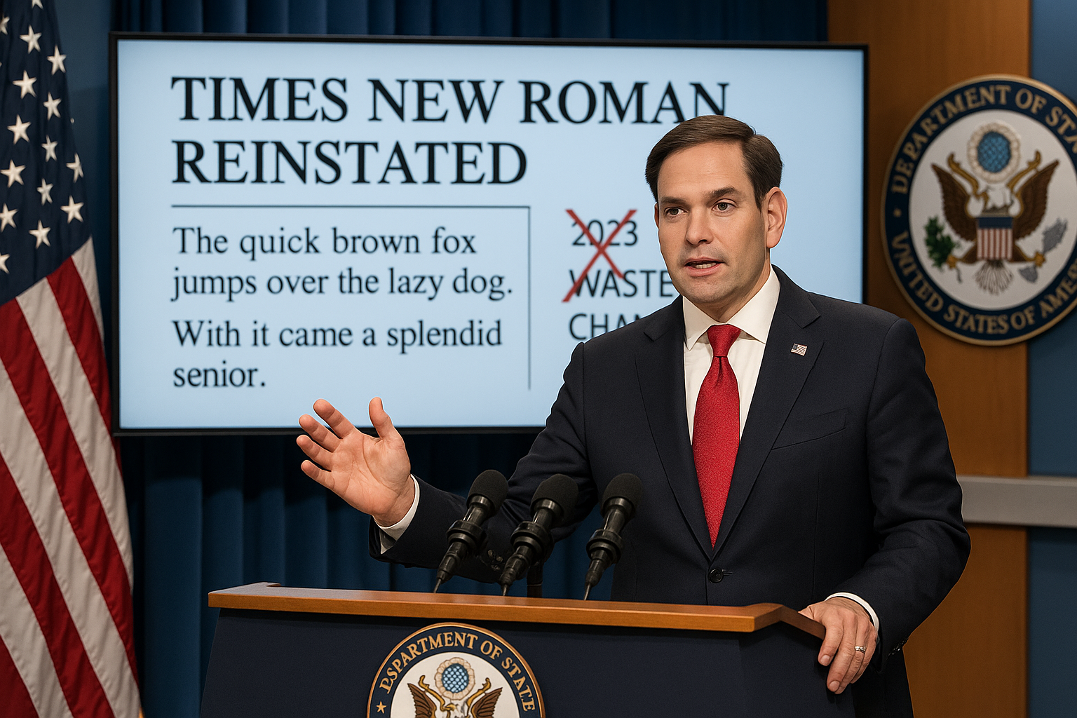
Secretary of State Marco Rubio has reinstated Times New Roman as the standard font for official State Department communications, overturning a 2023 decision under Antony Blinken to switch to Calibri. The earlier change was promoted as an accessibility measure, while Rubio has condemned it as a wasteful diversity initiative and said the reversal is meant to restore professionalism and present a unified voice in foreign relations.
In 2023, under then–Secretary of State Antony Blinken, the U.S. State Department adopted Calibri as its primary font for official communications, replacing Times New Roman. According to a memo reported by multiple outlets, including The Daily Wire and the Associated Press, that shift followed recommendations from the department’s diversity, equity and inclusion offices and was framed as an accessibility measure for individuals with disabilities, including those with low vision or dyslexia and people relying on screen readers.
Calibri, a sans-serif font with softer curves and wider spacing than Times New Roman, was promoted internally as easier to read on screens and in digital formats. As part of the Blinken-era change, the standard font size for many department documents was increased from 14 to 15 points, according to The Daily Wire’s account of the internal guidance.
On Tuesday, incoming Secretary of State Marco Rubio issued a directive reversing that policy. In a cable to all American diplomatic posts titled "Return to Tradition: Times New Roman 14-Point Font Required for All Department Paper," Rubio ordered a return to Times New Roman as the department’s default typeface. The memo, excerpts of which were published by The Daily Wire and confirmed in reporting by outlets including the Associated Press and Fox News, stated: "To restore decorum and professionalism to the Department’s written work products and abolish yet another wasteful DEIA program, the Department is returning to Times New Roman as its standard typeface. … This formatting standard aligns with the President’s One Voice for America’s Foreign Relations directive, underscoring the Department’s responsibility to present a unified, professional voice in all communications."
Rubio has repeatedly criticized the prior switch to Calibri as "wasteful" and said it contributed to "the degradation of the department’s official correspondence," language that appears in his cable and has been quoted by several news organizations. In the same directive, he argued that serif fonts such as Times New Roman are generally perceived to signal tradition, formality and ceremony and therefore better suit official letterhead and the tone of international diplomacy. By contrast, he described Calibri as more informal and said it clashed with the State Department’s existing letterhead design.
The Rubio memo cites broader administration guidance — described publicly as President Donald Trump’s "One Voice for America’s Foreign Relations" directive — in arguing that consistent formatting across cables, internal memoranda and external correspondence reinforces a unified, professional U.S. voice abroad. A State Department spokesperson, quoted by Fox News Digital, similarly said the new standard "aligns with the President’s One Voice for America’s Foreign Relations directive" and is intended to strengthen the department’s credibility through consistent presentation.
Accounts of the original Calibri policy and its reversal differ on how much the 2023 change improved accessibility. Supporters of the Blinken-era move, including accessibility advocates cited in outlets such as TechCrunch and other technology and policy coverage, have pointed to research and guidance suggesting that sans-serif fonts with wider spacing can help some readers with dyslexia or low vision, though experts note that findings are mixed and user preferences vary. Rubio’s cable, as reported by the Associated Press and other news organizations, contends that the promise of better accessibility was not fulfilled and claims the shift to Calibri cost the department roughly $145,000 in additional expenses, without providing underlying documentation.
The episode underscores how diversity, equity, inclusion and accessibility (DEIA) initiatives in the Biden administration had extended even to typographic standards in government operations, and how those measures have become a target in the Trump administration’s broader rollback of DEI programs. Since taking office in January, Rubio has moved to dismantle several DEI and accessibility-related initiatives within the State Department in line with White House directives. The fight over whether official documents should be set in Calibri or Times New Roman has become a proxy for a larger debate pitting advocates of accessibility-focused design against those who prioritize traditional formats and visual continuity with long-standing government styles.

